0%

Frank is a student utility service in Finland that provides student ID and various benefits under one roof.

Research
To gain insights into the needs and preferences of Frank's target users, was conducted a comprehensive research, that involved user interviews, competitor analysis, and UX audit.
Through this research, it became clear that users were dissatisfied with the app's appearance and found certain features, such as intrusive advertising, quite in-your-face.
Through this research, it became clear that users were dissatisfied with the app's appearance and found certain features, such as intrusive advertising, quite in-your-face.
The primary goal of this redesign project was to enhance the user experience (UX) and make the app more visually appealing. The existing design was outdated, which negatively impacted usability and overall effectiveness.
Research
UX/UI design
UX/UI design
Goal
Role
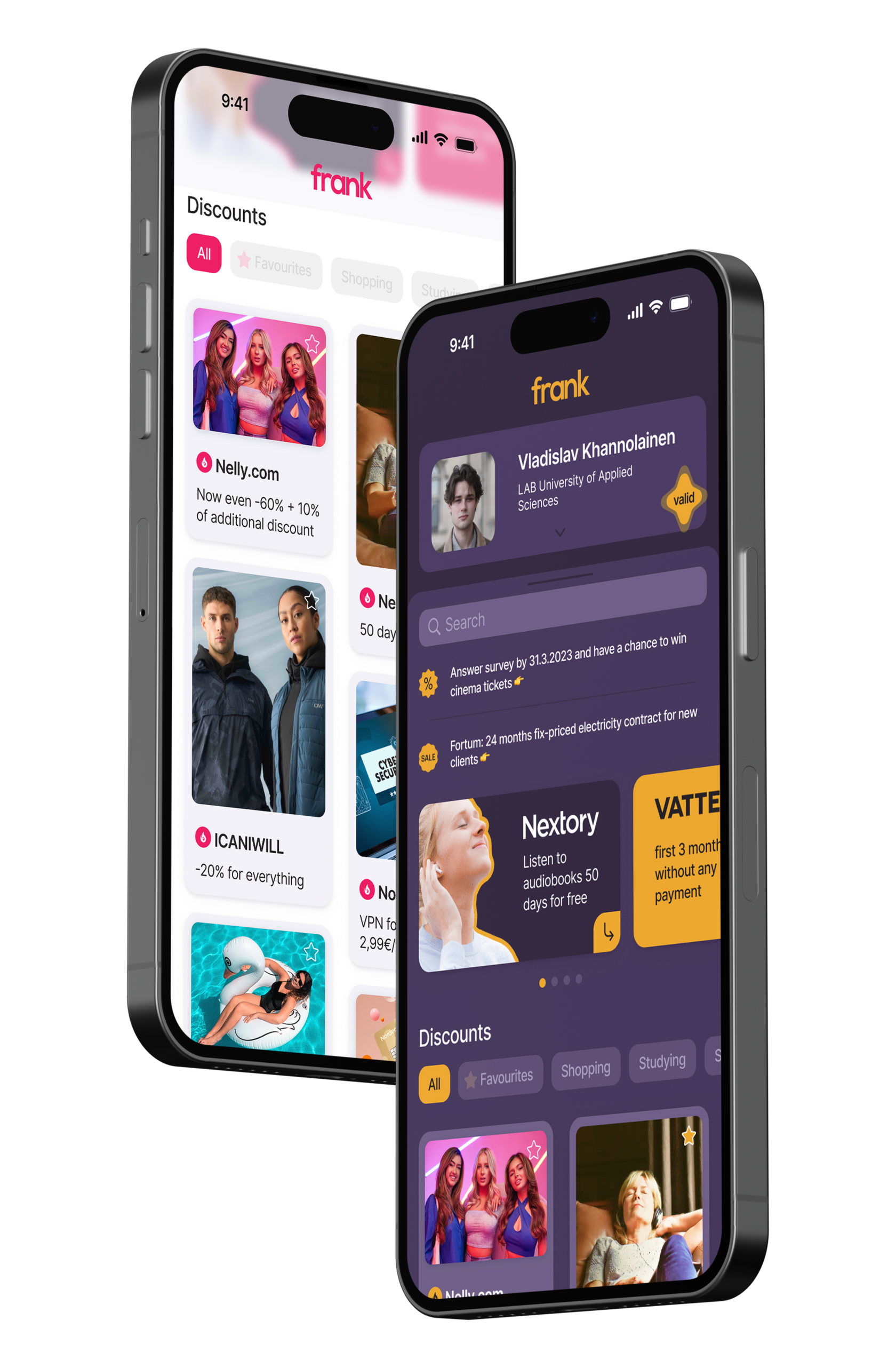
Original design's problems

Undistinguishable header
"Imperative" tips
Complex survey feedback process that includes 4 different pages
Unnecessary tap bar
Item cards are visually unappealing and lack a cohesive design style
Banners that are hard to read
Poor color palette
Notifications about discounts, which are already in feed
Solutions


dark
light
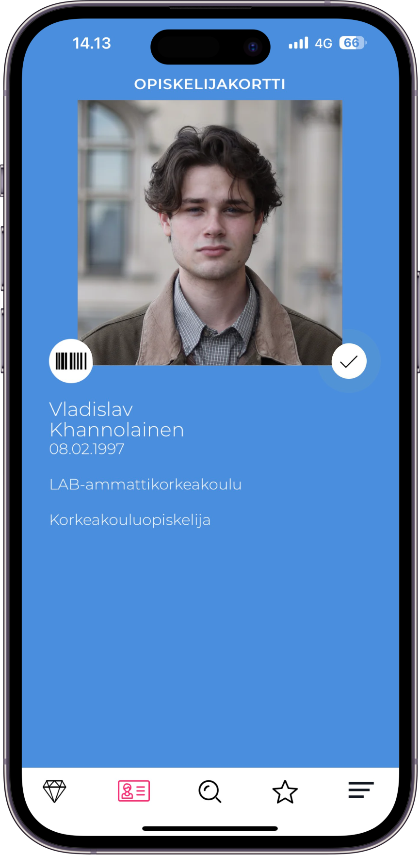
Student ID
The student card is now persistently displayed at the top of the screen and can be expanded by scrolling. Additionally, the validity tag animation is visible in both expanded and collapsed states.
before
after
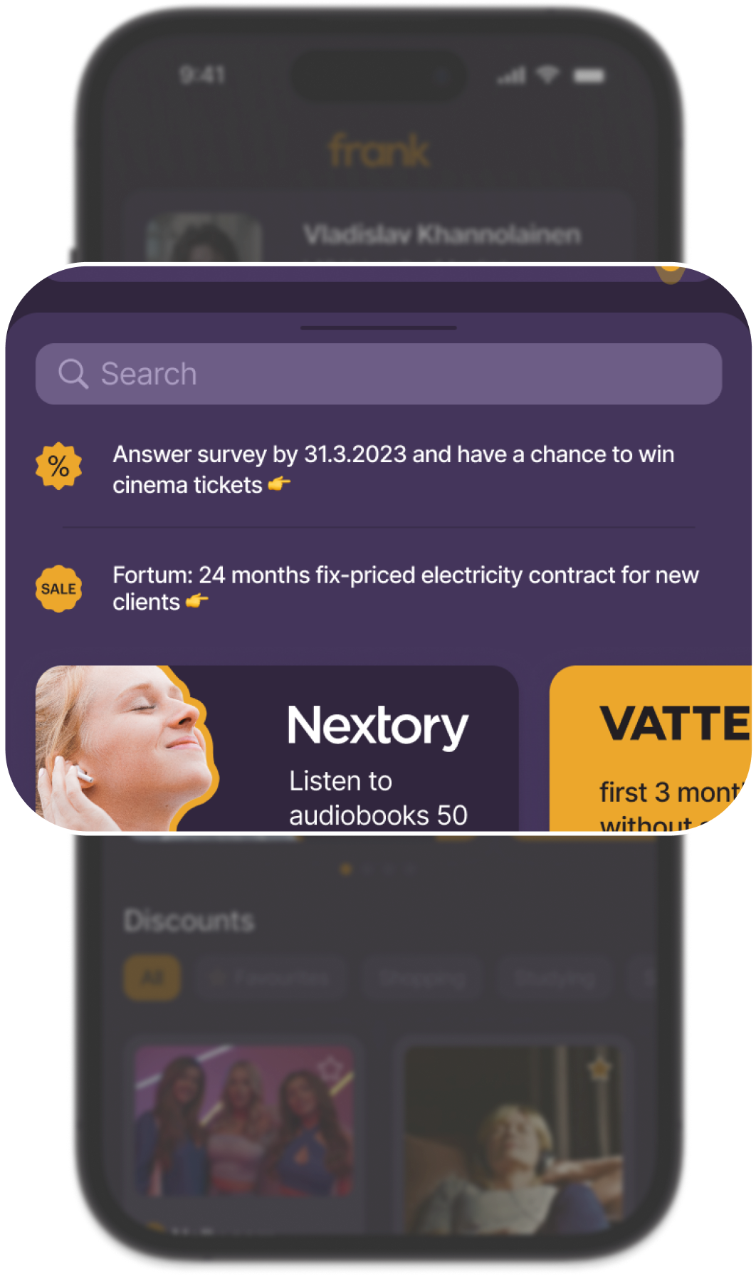
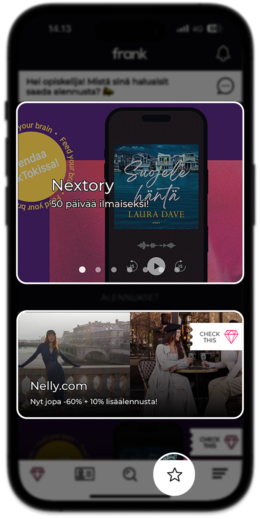
Notifications and search bar
The search function has been relocated to the top of the discount section. Notifications now appear in a visible area directly beneath the search bar, eliminating the need for a separate page.

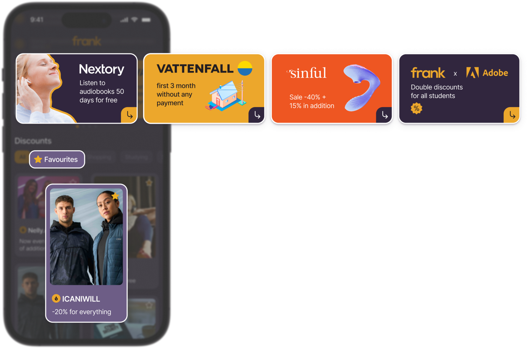
Item cards and favourites
The visual style of banners has been updated to be more informative and visually appealing. The “Check this” tag has been redesigned as a “Hot Deal” icon. Favourites are now integrated into the filter options.
Item card page
Instead of navigating to a separate page, the card now slides up from the bottom. The description text is hidden by default and can be expanded, creating a cleaner and more visually appealing layout.

before
after
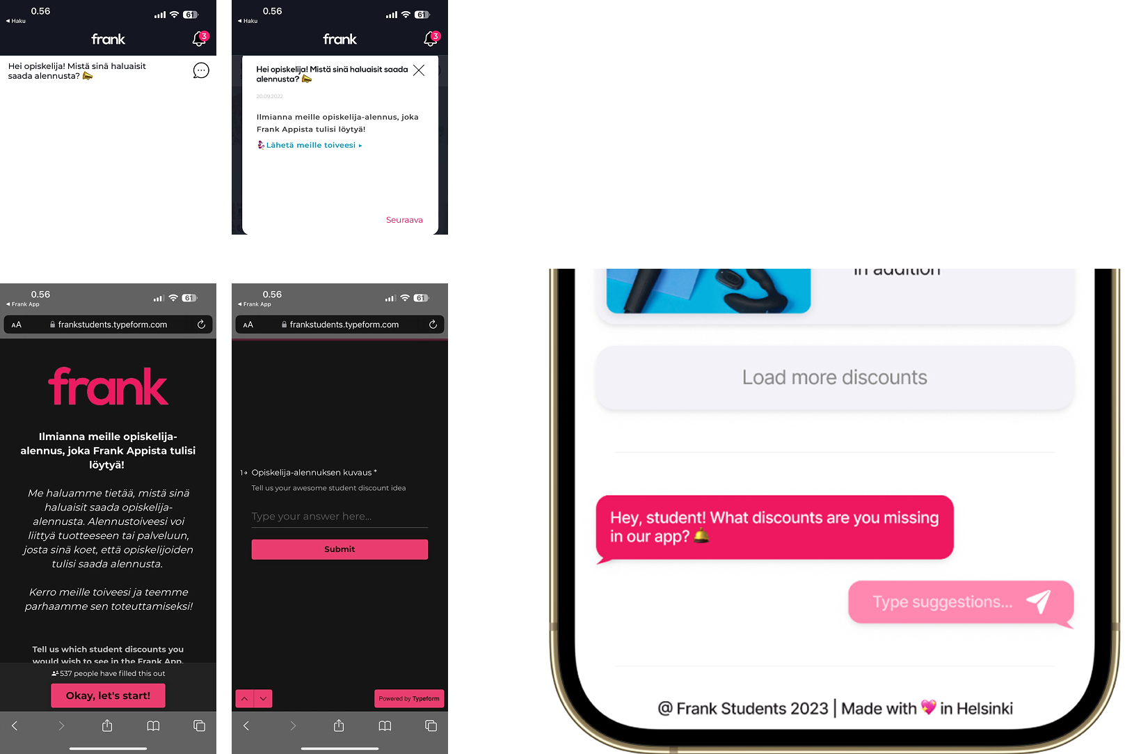
Survey
A single-step solution has been developed for students to share their thoughts and request a discount. It functions like a chat, allowing users to send direct messages easily.
old algorythm
updated algorythm
Conclusion
The Frank app’s usability and design enhancements were demonstrated through a concept presentation and a working Figma prototype. Student feedback highlighted the improved experience, with particular praise for the updated student ID card as a more appealing daily accessory.
The project's objectives of improving usability, updating graphics, and making advertising more approachable were all accomplished. The app's increased appeal and ease of use are highlighted by the overwhelmingly positive response.
The project's objectives of improving usability, updating graphics, and making advertising more approachable were all accomplished. The app's increased appeal and ease of use are highlighted by the overwhelmingly positive response.